Google Data Studio is Google’s new data reporting and visualization tool. It allows you to build beautiful reports to show data from several different sources. This data can be displayed using a large set of graphs, charts, tables and other visualization elements. In this post we will show you how to get started and create your first report with Google Data Studio.
The two basic parts of any data report are your set of data (data sources) and the visualization you build using the data (widgets). We will first setup a data source and then build a widget based off of this.
Step 1: Add a Data Source
Data Sources can be added to Data Studio using a range of built in data connectors. The built-in connectors are mostly for Google products like Google Analytics, BigQuery and AdWords but also includes database connectors like MySQL and CloudSQL. Google has just released an update that allows for third-party providers to create their own connectors. These Community Connectors now include social networks like Facebook and Twitter, ad platforms like Bing Ads and Facebook ads and SEO tools like Moz. You can also add data from any platform by first adding it to a Google Sheet and then importing it into Data Studio using the Google Sheets connector.
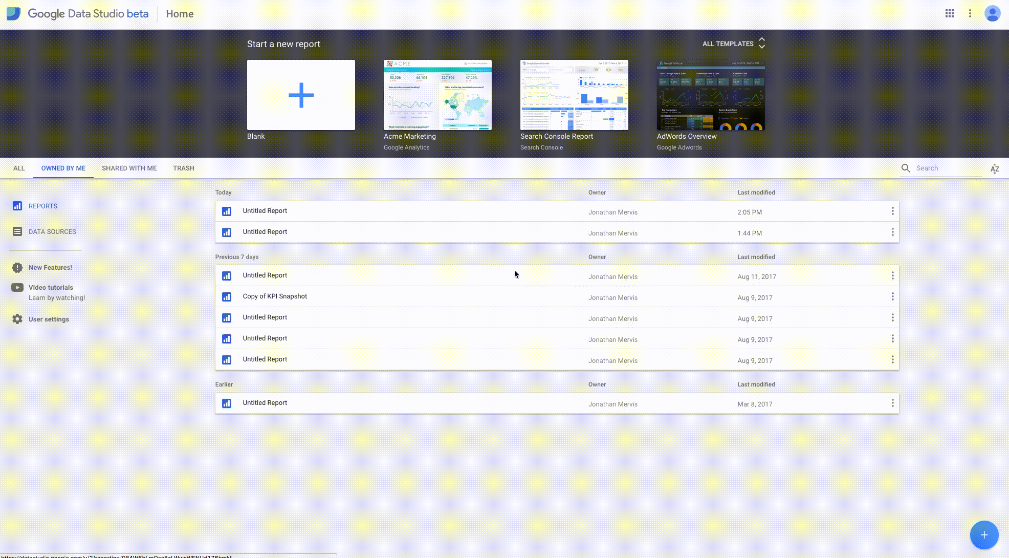
The first thing you need to do to set up your Data Source is to create a new report. Do this by clicking on the Plus button on the home page of Google Data Studio. This will create a new blank report.
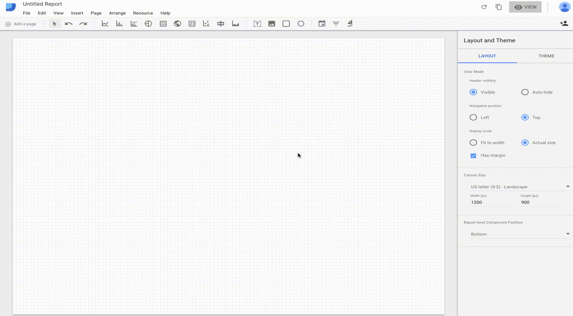
You will be asked to add a data source in the panel on the right hand side of the page.
Adding a Data Source is a simple process. In this example, you will add a Google Analytics Data Source:
- Click the Create New Data Source button.
- From the left hand side menu select Google Analytics.
- You will be prompted to authorize the connection between Data Studio and Google Analytics. Click Authorize.
- Select the Google account you wish to connect to Data Studio.
- Once authorized you can select the Google Analytics Account then the Property and then the View you want to get data from.
- Click the blue Connect button in the top right corner of the page.
- Your data source is now connected. You will be shown the full list of metrics and dimensions available in the new data source. Click the blue Add to Report button in the top right corner of the page.
All these steps are shown in the GIF below:
Step 2: Add a Widget
Now that you have a data source setup you can begin to create our visualizations. In the top menu bar of the report you will find all the visualizations that you can add to your report. These include:
- Time Series graphs
- Bar Charts
- Pie Charts
- Tables
- Maps
- Scorecards
Additionally, you can add design elements like shapes and textboxes that make your reports easier to understand. There are also some very useful report controller elements available. These elements let you change what data you see in the report. They include a Date Selector so that you can change the date range of the data. There is also a filter controller which allows the data shown in the entire report to be modified. Recently Google released an update to Data Studio that includes a new controller called the Data Control. This lets you quickly change a report to show data for any of the Google Analytics accounts you manage.
In this example you will create a simple time series graph that shows the number of sessions that Google Analytics recorded.
- Click on the Time Series button in the toolbar.
- Use your mouse to draw the area on the report where you would like the graph to be.
- The graph will be added to your report. Clicking on the graph will show its properties in the panel on the right of the report.
Follow the steps in the GIF below:
Most graphs and tables are made up of a combination of metrics and dimensions. In the time series graph the dimension is the graph’s x-axis and the metric is the y-axis. Your new graph will automatically have Date as the dimension and Sessions as the metric. This shows the number of sessions recorded in Google Analytics for each date in the time series.
Step 3: Customize the widget
You can change your metric and dimension to show exactly the data you need. For this example the combination is already correct. There are several other options you can change in the Time Series Properties to get exactly what you need in the graph.
For this example, the only change you will make is to add a comparison period to the graph. The previous data will show as an additional line in the graph. This allows users to compare the current data to the previous period.
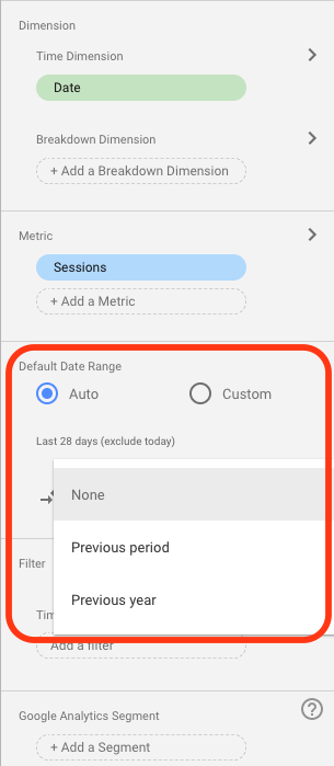
- In the Default Date Range section leave the radio button on Auto and click on the dropdown menu below it. This currently reads “None”.
- Select “Previous period” from the dropdown and you will see another line appear in the Time Series showing the sessions for the previous period.
Next Steps
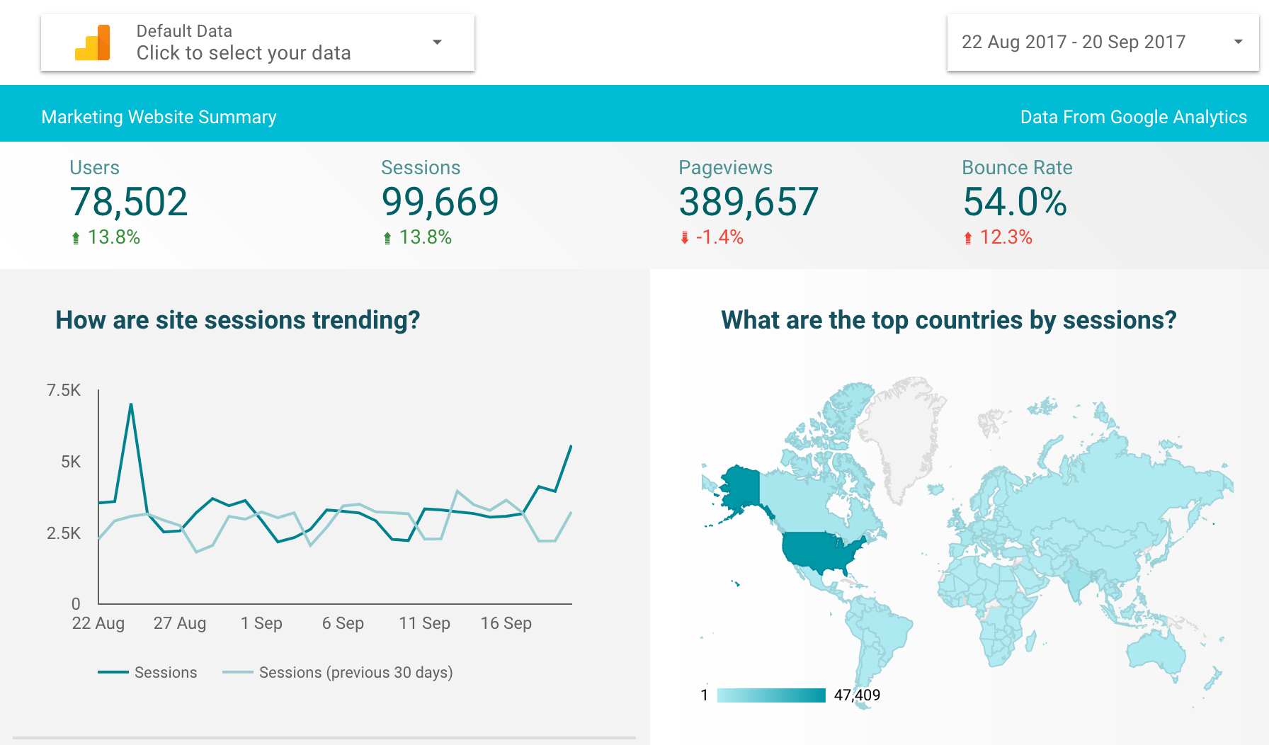
That’s it! You have just created your first Data Studio report. You have a graph with information from Google Analytics that includes both the current data and a comparison to the previous period. Using the basic steps you have gone through in this blog you can create all the elements you need for detailed and effective reports.
The next step would be to expand your report to include all the data you need to see on a regular basis. In our next Google Data Studio blog post we will show you how to create a KPI snapshot dashboard for your marketing data as well as some more detailed marketing reports.
If you have any question or comments about Google Data Studio then please send me an email.