A few weeks ago we analyzed the website of Zurich Open Air to optimize their conversion goals.
In this case study the basic steps of a conversion optimization project will be shown based on a real and successful example with great results.
A project to optimize the conversion goals is based on the following steps:
1. Definition of conversion goals and call to action
2. Design optimization of the relevant buttons and links
3. Measurement of the user behavior
1. Definition of conversion goals and call to action
First, the conversion goals need to be defined. In the case of Zurich Open Air the conversion is based on the ticket sales – the visitors of the website become visitors of the festival by buying a ticket. The call to action is therefore the ticket buttons or ticket links. On the Zurich Open Air website the homepage contains a big buy-ticket-button and on the ticket page you find a link for every ticket type which leads you directly to the selected day pass or to the camping access on the Starticket website.
2. Design optimization of the relevant buttons and links
The relevant buttons are part of the start page and the ticket page – on the start page it is the ticket button at the top of the page and on the ticket page the links for the different ticket types are relevant.
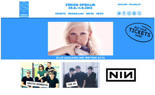
The analysis of the ticket button on the start page showed, that despite the fact that the button had a prominent position at the right top of the page, the button did not stand out and ask for action. One thing was the black color and the design of the button which did not make the button really eye-catching. Based on the form and design of the button, it was also hard to get the point that this element was clickable. This impression was supported by the missing hover state.
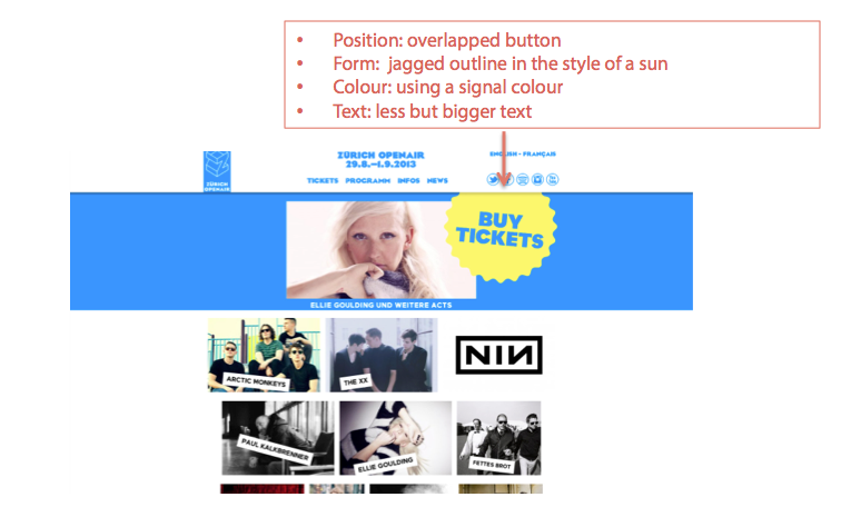
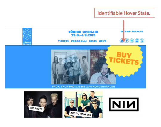
To increase the clicks on the ticket button, the button itself was re-designed. The objective was to make it more appealing and increase the visibility. For the new design, the position of the button on the page was changed as well as the form, the color and the text. Thanks to the new hover state based on a changed text color from blue to orange the user got next to the changed cursor another hint that the button is clickable.
If the user hovered over the links on the ticket page they changed their color from black to grey. It was very difficult to see the color change as the difference between the two colors was too small. On the same site the blue colored link to the Starticket website drew a lot of attention.
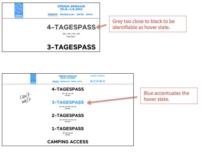
With the color changed from grey to blue, the hover states of the links for the different ticket types were clearly recognizable after the re-design. As the link to the Starticket website is more informational and not a call to action this link’s visibility was decreased with the new design. The link was adapted to the surrounding text and colored black. Only the changing cursor symbol while hovering over the anchor text indicated the existence of the link after the re-design.
3. Measurement of the user behavior
The relevant metric to measure the user behavior in relation to the conversion goals is the click-through-rate. We measured the click-through-rate using Google Analytics and defined it as follows:
- Number of page views of the start page / Number of clicks on the ticket button
- Number of page views of the ticket page / Number of clicks on the different ticket types
- Number of page views of the ticket page / Number of clicks on the Starticket link
The results were impressive:
Thanks to the optimization efforts the click-through-rate of the ticket button on the start page increased by 61.52%. The improvement of the click-through-rate for the ticket links on the ticket page was 13.75% on average for all ticket types. As intended, the click-through-rate of the link to the Starticket website was lower than before and decreased by 95%.
As these results show, the changes in the click-through-rate based on the optimizations were not only bigger than expected, thanks to the measuring of the relevant metrics the impact of the conversion optimization could also be proved with numbers.
This example also demonstrates, that a good planning and a structured process of your conversion optimization project will lead to relevant and successful results.