With the amount of data that is associated with digital marketing, it is easy to get overwhelmed – especially for non-digital team members. It is therefore becoming increasingly important to visualize this data in an easily readable way that everyone is able to understand. The Digital Marketing Dashboard!
Before we start, this blog post will not provide you with a one-size-fits-all solution. Every business differs and subsequently, we believe that every dashboard should differ too. Instead, we are going to take you through a couple of key dos and don’ts of dashboard design, so that you can design your perfect dashboard!
A Dashboard for Dashboards sake
Dashboards can be such useful tools. They help you to pick up potential issues before these grow into major issues, give you a good overview of performance and help you to streamline processes.
Despite this, useless dashboards are being built every day. This nearly always boils down to one key problem – the lack of a clear requirement. When building a dashboard, there are two questions that need to be kept in mind during every step of the process:
- Who will be looking at the dashboard?
- What decisions will be made based on this data? Or what questions does the dashboard need to answer.
Every component on a dashboard needs to be there to help with making a decision. It is your job as the creator of the dashboard to understand what these decisions are and who is going to be making them.
If you are unable to answer either of these two points, go back to your team/boss/client and clarify these points. If you are not able to get a clear answer to either of these points, building that dashboard will in all likelihood be a waste of time.
Less is More
Perhaps the biggest mistake made in dashboard design is cluttering dashboards and/or violating the sacred one-page rule.
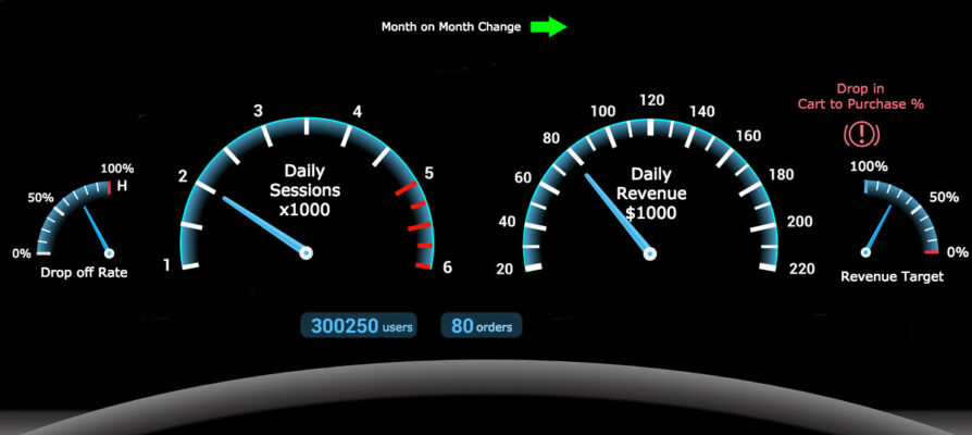
A dashboard should always be readable in a single glance. The analogy that has stuck with me is that of a car dashboard – if you need to look around, try to decipher complicated graphs or need someone to explain it to you – it’s not a good dashboard.
So:
- Make sure that all components in the dashboard can be used to answer those questions defined in the requirements. If not, you know where the delete key is.
- Make sure you stick to the sacred rule and keep it to one page. Everything should be readable in a single glance, just like that car dashboard.
- Don’t overdesign, try to prioritize functionality over design.
- Use the space effectively, draw the users’ attention to the most important components by making them BIG!!
- Finally, don’t overcomplicate things. Just because you are able to put together a 3D graph with 4 different series, doesn’t mean it should go on the dashboard!
A note on this. If you have left something important off the dashboard, the end user will ask that it be added. It is far less common for a user to ask that something unnecessary be removed.
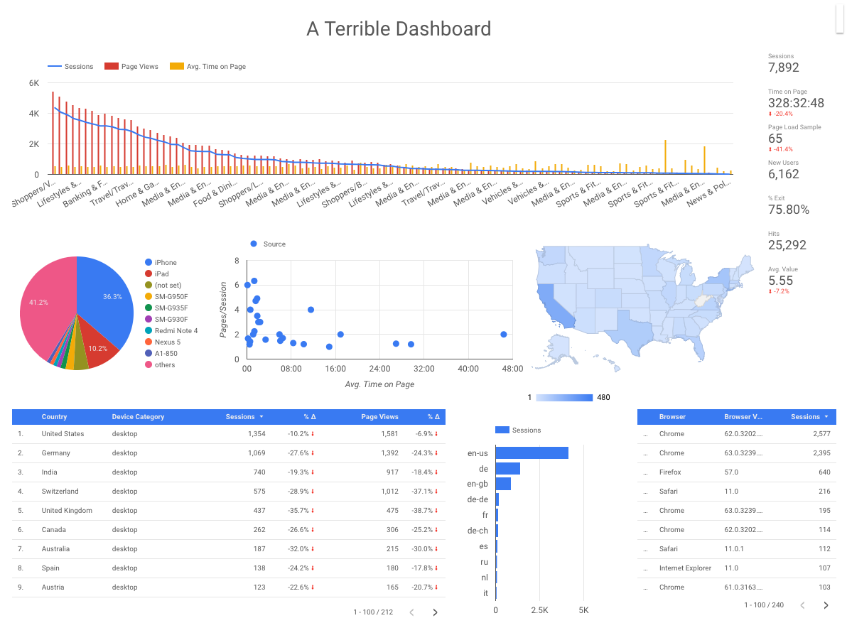
To prove this point, look at the two dashboards below and you decide which is more likely to drive action.
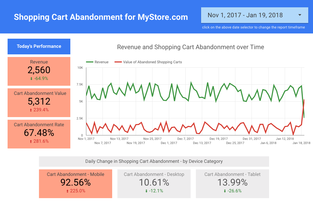
As you can see, the second dashboard answers a clear question – How much revenue is lost due to cart abandonments. It can also be used to identify issues as soon as they occur (for example the removal of the checkout button on mobile as displayed above).
This is in contrast to the first dashboard, that is overcrowded with too much data, has no emphasized information and lacks any clear question that it aims to answer.
Can everyone understand it? (Especially your target audience!)
This is why you need to know who will be using the dashboard, you need to make sure that they will understand it.
Does your CEO know the difference between sessions and users? Do your developers understand the difference between page views and events? If they don’t, avoid using these terms or make sure you explain them.
Here are some handy ways to ensure that everything in your dashboard is understood:
- Simplify your graphs (just like the dashboard on which it sits, when it comes to graphs – less is often more!)
- Make sure not to clutter the dashboard as this makes things not only confusing, but also intimidating for someone who is further removed from the subject matter. (See the example of a terrible dashboard above).
- Add annotations! When you need to add something that you believe may be misunderstood. Add some text to help clarify what it is you are showing.
- If you have filters or any sort of interaction points, provide explanations within the report on how to use these. It may be common sense to you, but you built it, so your view may be a little biased.
You can’t change the Past
As mentioned initially, dashboards are used to make on the fly decisions, to spot errors and rectify them and to measure impact in real time. This only works if your dashboard makes use of the latest possible data.
Unfortunately, “the latest possible data” is difficult to pin down, as this differs across industries, projects and platforms. In some cases, it will be down to the second data, in other cases hourly or daily data.
The key concept here, is that you are not waiting for the end of the month to manually pull data from different sources. That is the responsibility of reports, not dashboards. Dashboards should be used to spot issues as soon as they occur – like the heading says, you can’t change the past.
Fantastic, let’s get started!
Now that you have a better idea of how to go about putting together your dashboard, take a look at our posts on Google Data Studio and Klipfolio. Two fantastic Dashboarding solutions that allow you to easily build your awesome custom dashboard.
Once you have built your dashboard DO get feedback, try new things and make changes. Chances are, your first dashboard is not going to be perfect. By constantly improving though, it is only a matter of time until your dashboard gets consulted before and after every important decision.
If you have any more questions about dashboards, please send me an email.